Sabre Adhesives
Brand Strategy, Brand Identity, Packaging, Videography, Photography, Website, Campaign
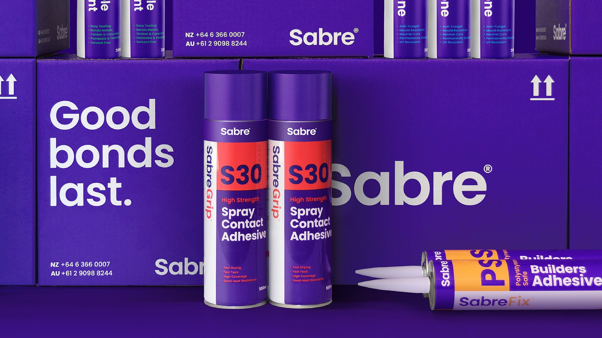
Sabre Adhesives, formerly Maxilam, embarked on a transformative journey to redefine the adhesive industry. Our mission: to create a standout brand that defied norms in a market saturated with dark blues, grays, and reds.
-
Our challenge was twofold: position Sabre in an uncharted color space while infusing a human touch, emphasising meaningful connections in adhesives. We aimed to convey a larger brand presence while preserving Sabre's core values. Our approach? Unconventional. Rather than diving into identity design, we analysed competitors' colors, uncovering untapped opportunities for a unique visual identity.
"Good Bonds Last" became Sabre's heart, symbolising both adhesive efficacy and lasting client connections. The brand system centered on unity — two parts coming together. We chose an empowering violet, breaking from tradition. A complementary color palette enhanced the new identity. With this rebrand, Sabre Adhesives boldly steps into the future, leaving a lasting impression in the adhesive industry.


“From strategy and positioning, right through the design process, the team at band were a pleasure to work with. We are thrilled with the results and the relationship is on-going.”
Almanzo Simmonds
Manager – Sabre Adhesives